
Down the PhoneGap Rabbit Hole
I can still remember the day I picked up my first iPhone, a piano black 3G, the first iPhone they’d released in Australia. The little tike could do everything; surf the net, play 3D games, sync my contacts, make phone calls. I got all excited about writing my own apps for it, and then I just did nothing. The unwieldy Objective C syntax and the rather hectic day job whittled away all enthusiasm I had for building anything on the platform. Fast forward 4 years and the iOS development environment is a lot less prickly thanks to the introduction of development frameworks, and in particular, PhoneGap. PhoneGap allows you to write apps, for multiple mobile platforms, using good ol’fashioned HTML & Javascript instead of having to learn the underlying languages for each. Obviously there are tradeoffs, and they’re well documented (type “phonegap is ” into google), but the rapid development and multiplatform support should hopefully overcome any of the other foibles.
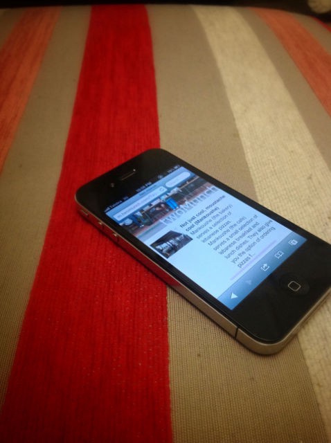
Apart from writing these tirades, I also co-run a bourgeoning Melbourne food blog. We’ve got a Wordpress site, with a custom theme I developed for the desktop, and a lighter one for mobile. It’s great, and I love running around taking photos of my food (much to the disgust of my dining companions) and I thought to myself that it would be great to expand in this area. I didn’t want a direct port of the website; that’s just useless; nobody uses those apps. So the goal is to make something people may actually use.
V0.1 — Proof of Concept
After spending a couple of nights sketching out the look and feel, I thought it would be time to see if I could translate it into HTML. Better to get a semi-functional proof of concept going than spend hours refining a design which ultimately doesn’t actually work on a phone. So using Eclipse as my editor, Bitnami MAPP as my app server stack, and the trusty Chrome Window Resizer, I translated my rather poor sketches into something that you could click through. Although both Chrome & Mobile Safari are Webkit at heart, there are some obvious differences that come into play, especially around speed. I’d made the innocent mistake of setting the initial-scale to 0.5 value, as a way of ensuring the page would look good on Retina devices. JQuery mobile didn’t like this, and so an animation that played perfectly well on my desktop, turned into a spluttering mess on the phone. Not really the kind of application experience I was looking for. So at the moment, I’m trying to iron out the JavaScript gremlins in the layout, using the Chrome extension Ripple. Ripple implements the PhoneGap APIs in Chrome, allowing easy debugging of web-apps written in PhoneGap (this remove the need to recompile the application after each change). Well, easier debugging, not easy debugging :)